About
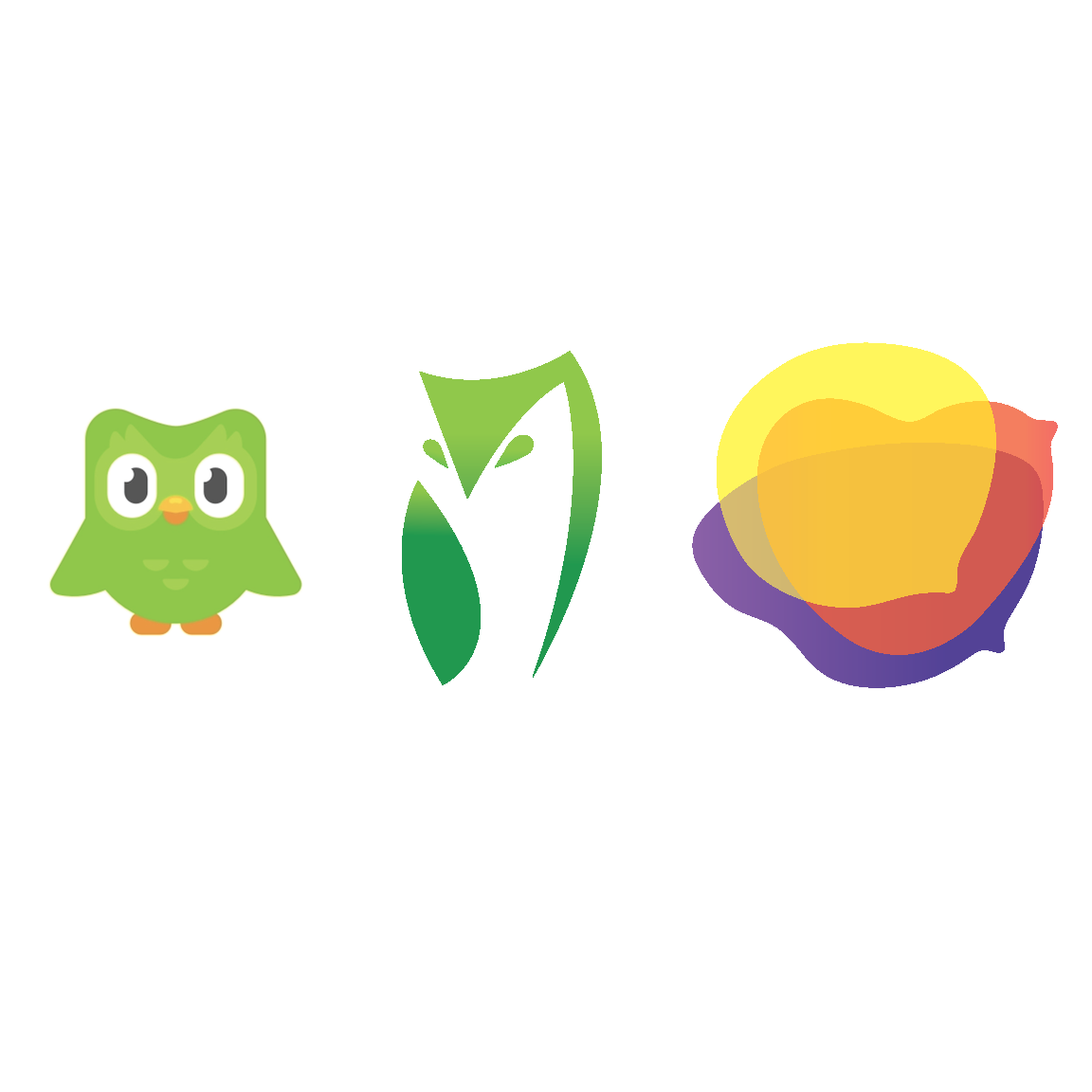
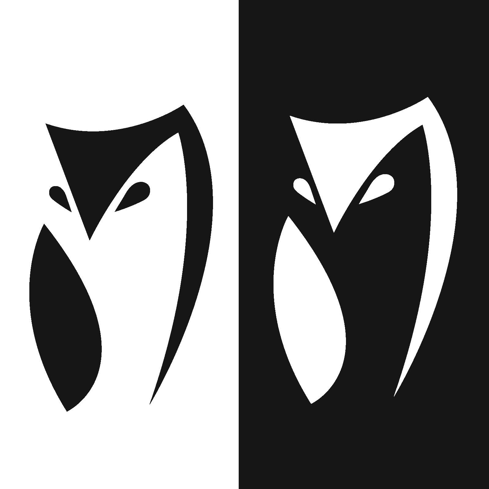
I redesigned Duolingo's brand identity in two key phases. First, I reimagined the original owl mascot to embody a more professional, minimalistic, and sophisticated look, aligning with a more mature audience. Next, I developed an entirely new brand identity that redefines the concept of a language learning platform. This new identity captures the essence of learning with a fresh, innovative approach that enhances the brand's appeal and reflects its commitment to modern education.
1. Original Logo Simplified
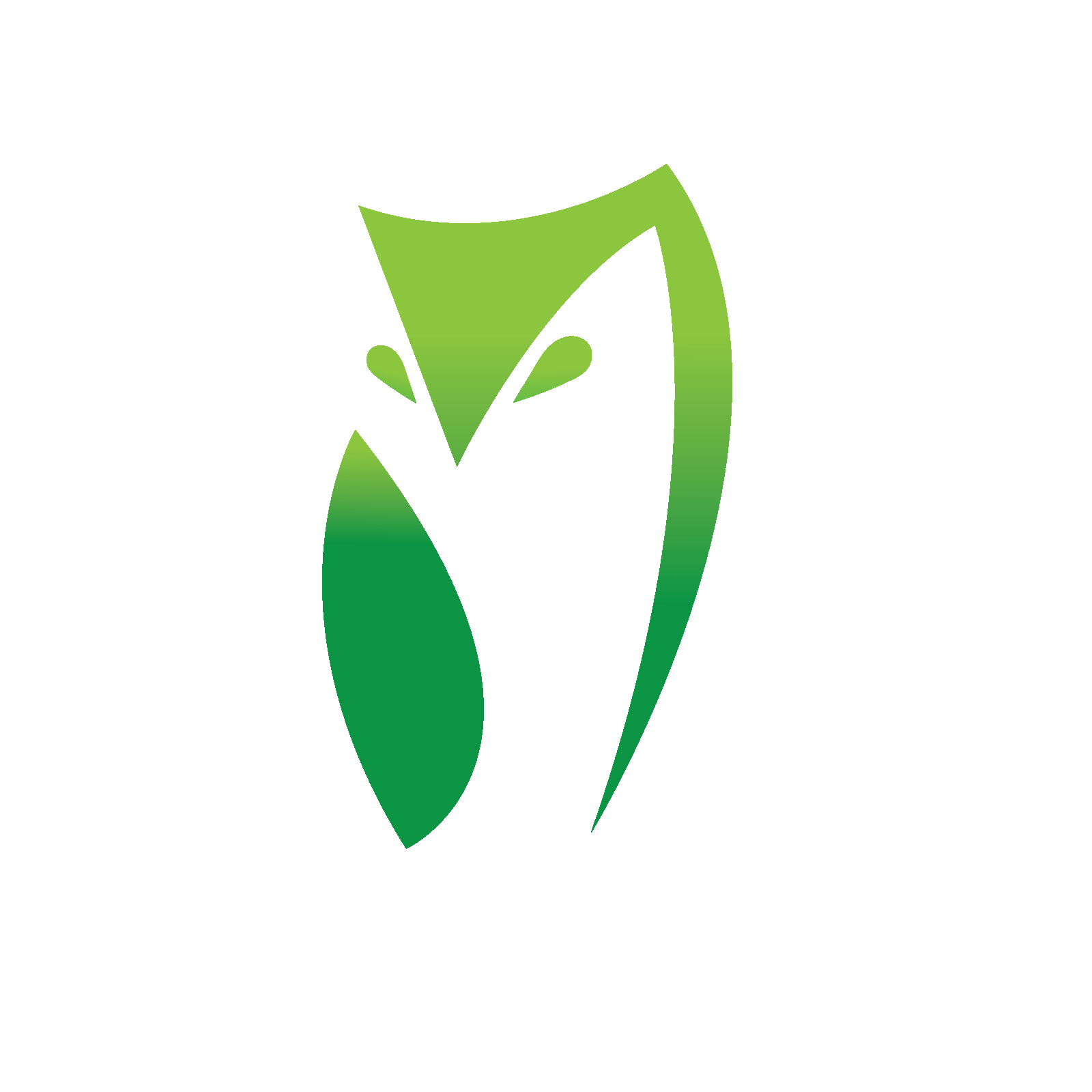
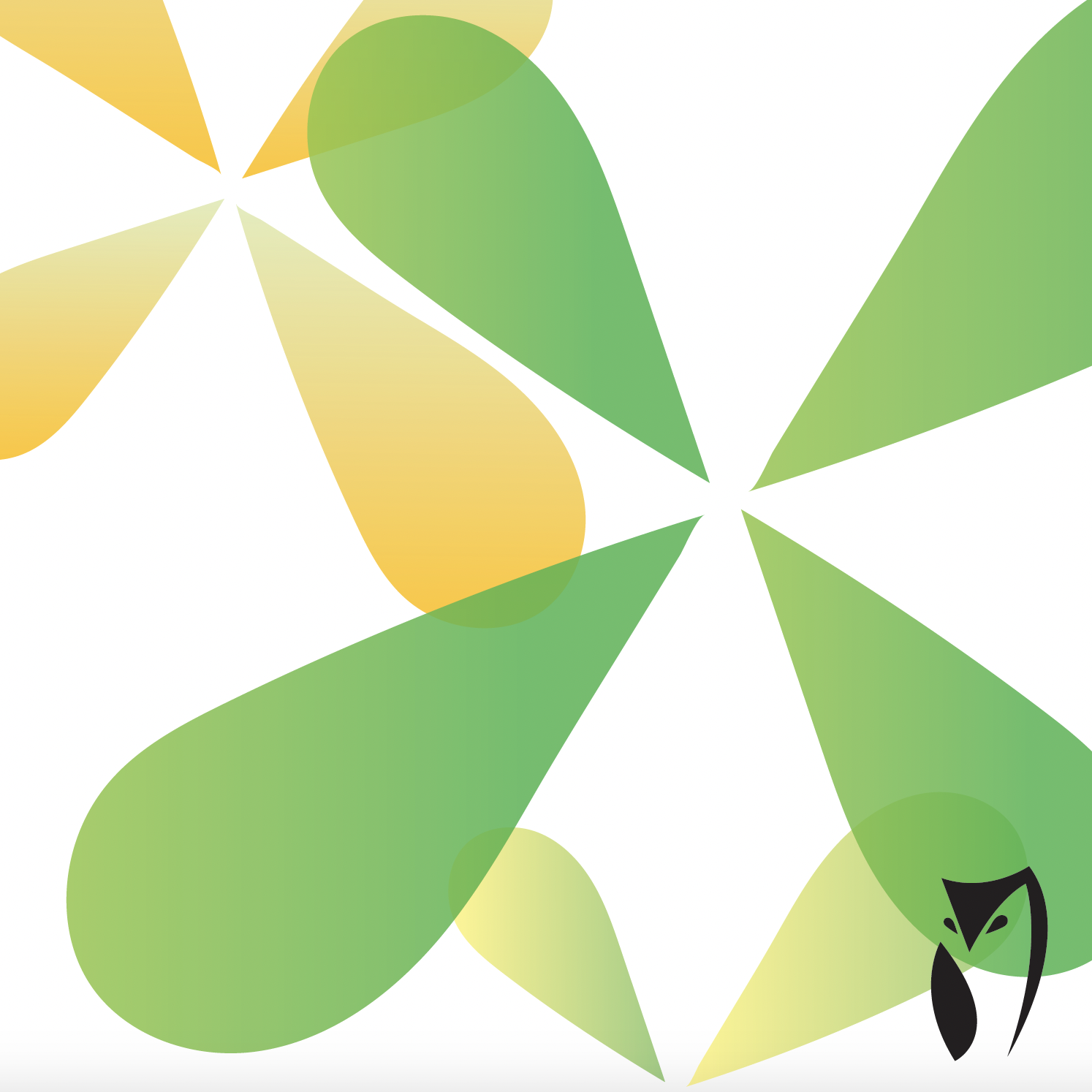
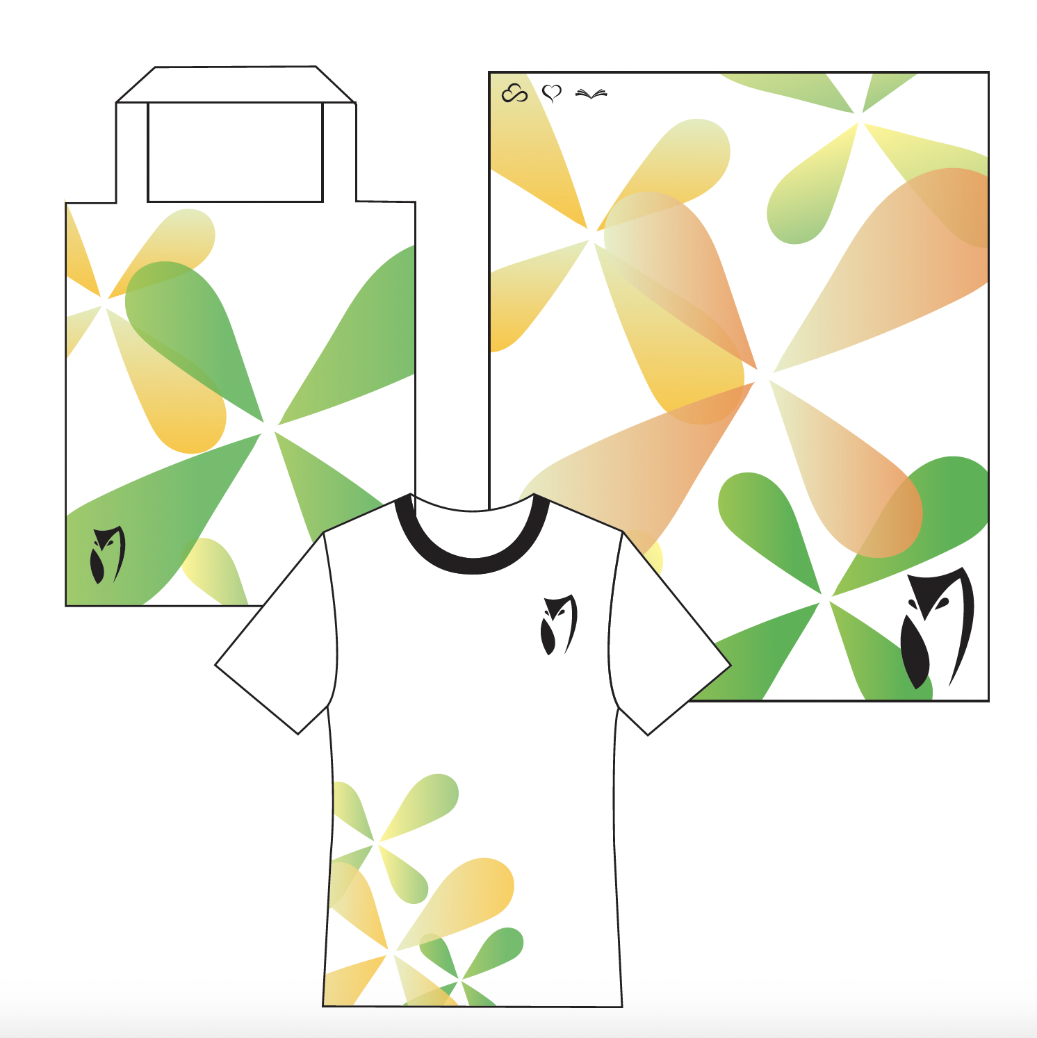
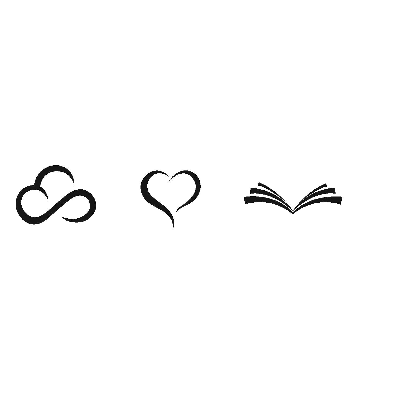
I redesigned Duolingo's iconic green owl to appeal to a more mature and professional audience. Sticking with the signature green colorway, I minimalized the mascot to achieve a sleek, sophisticated look. In addition to the refreshed owl illustration, I developed accompanying brand elements, including new icons and logos, to enhance the overall identity. To visualize how these changes would play out in the real world, I applied the new design to various merchandise, demonstrating its practical application and impact.
2. A New Take
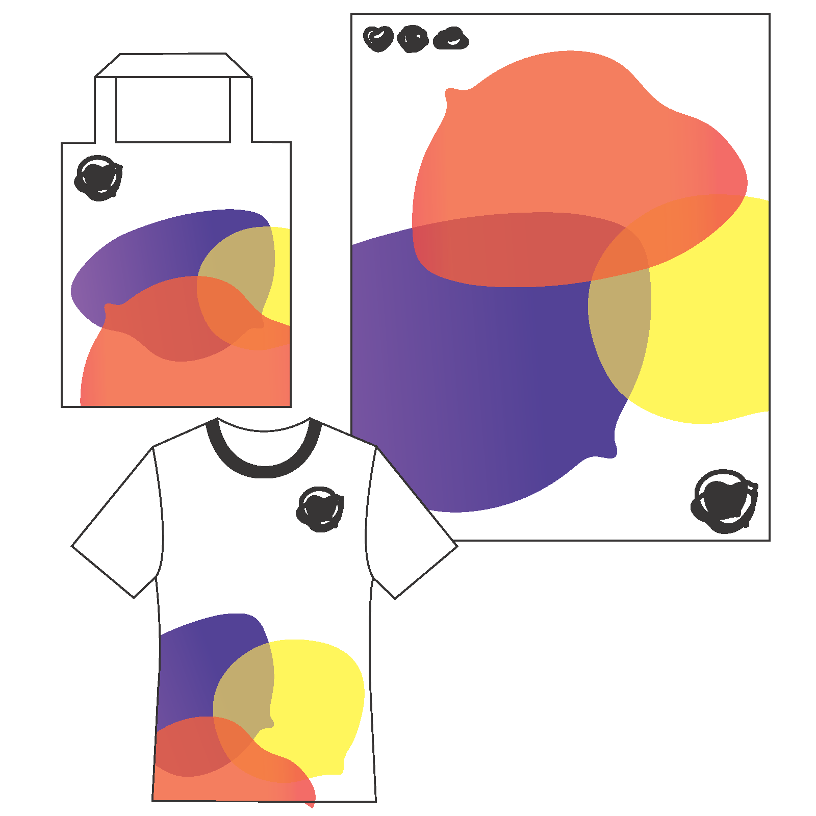
I reimagined Duolingo's brand identity by creating a fresh concept centered around the idea of message bubbles as a symbol of communication. This new identity merges the experience of speaking in person with the modern aspect of learning online. I introduced a vibrant color palette of red, purple, and yellow to foster a fun and inclusive atmosphere while maintaining the playful, game-like essence that Duolingo is known for. The updated look integrates these elements seamlessly, offering a dynamic and engaging visual identity that resonates with a diverse audience.

